Dark, unsound corners of the Haskell type system: http://t.co/9JrcMtQ4co
miniblog.
Related Posts
User profiles on websites have gone from "paste your CSS here" to "here's a smaller set of options that all look good".
I feel like app theming is following the same trend. So many apps just offer a dark mode and nothing else.
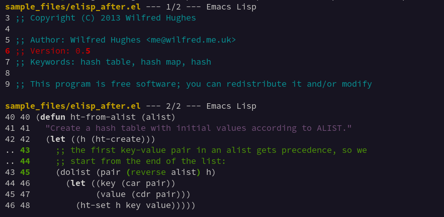
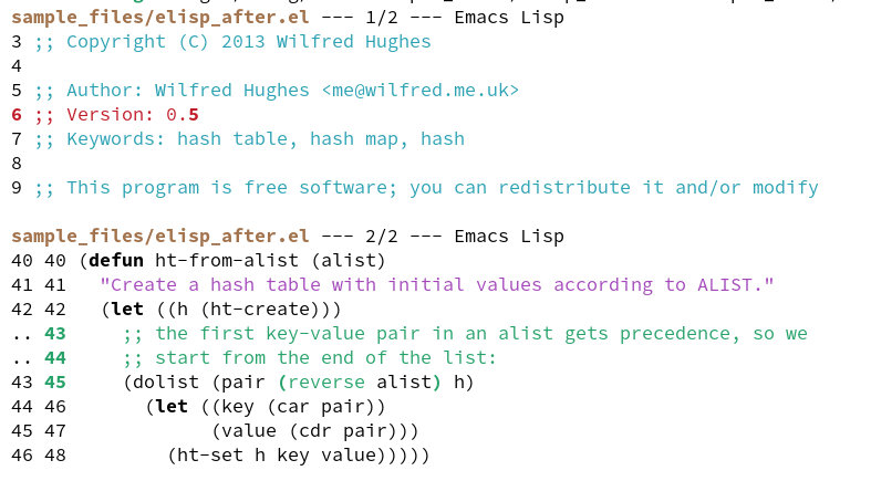
I'm feeling reasonably happy with the light and dark styles of difftastic now: there's a reasonable amount of contrast on both sides.
I'm now using ANSI bright colours for the dark theme and it works pretty well. I had to give up on cyan as it's too pale on light backgrounds.
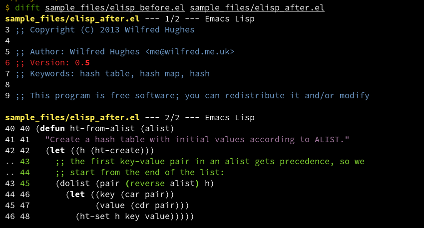
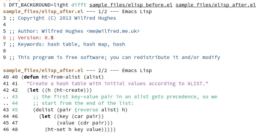
It is really hard to find good terminal colours for both light and dark themes.
I've replaced uses of 'bright' colours with bold as it seems to work better. git-diff does the same thing.
Explicit black and white colours are available, but you can't assume the default colour!