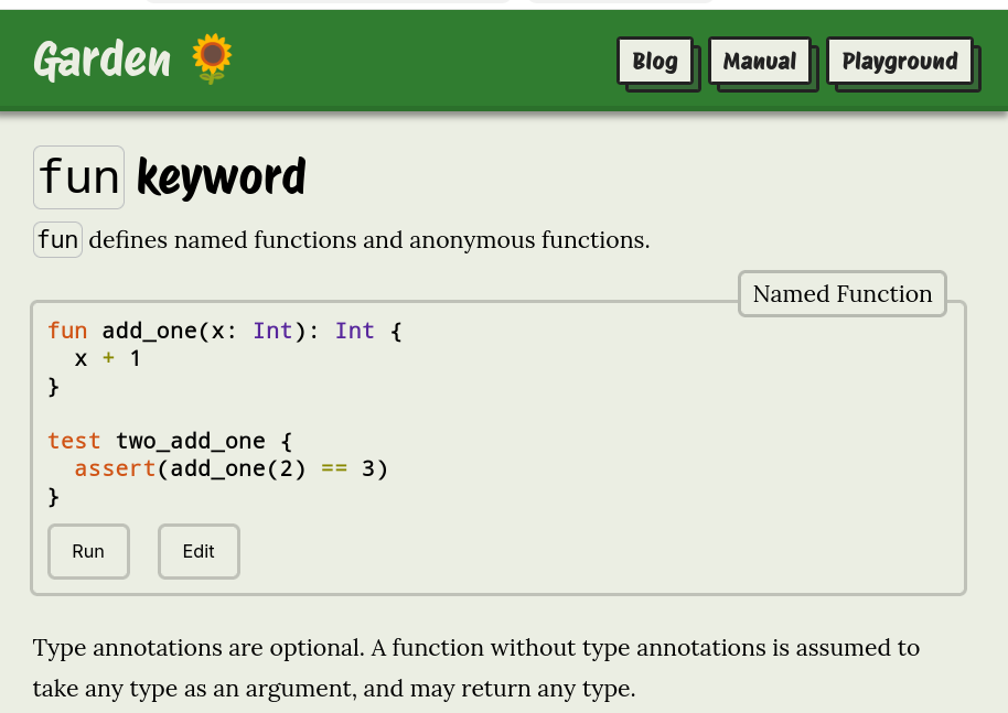
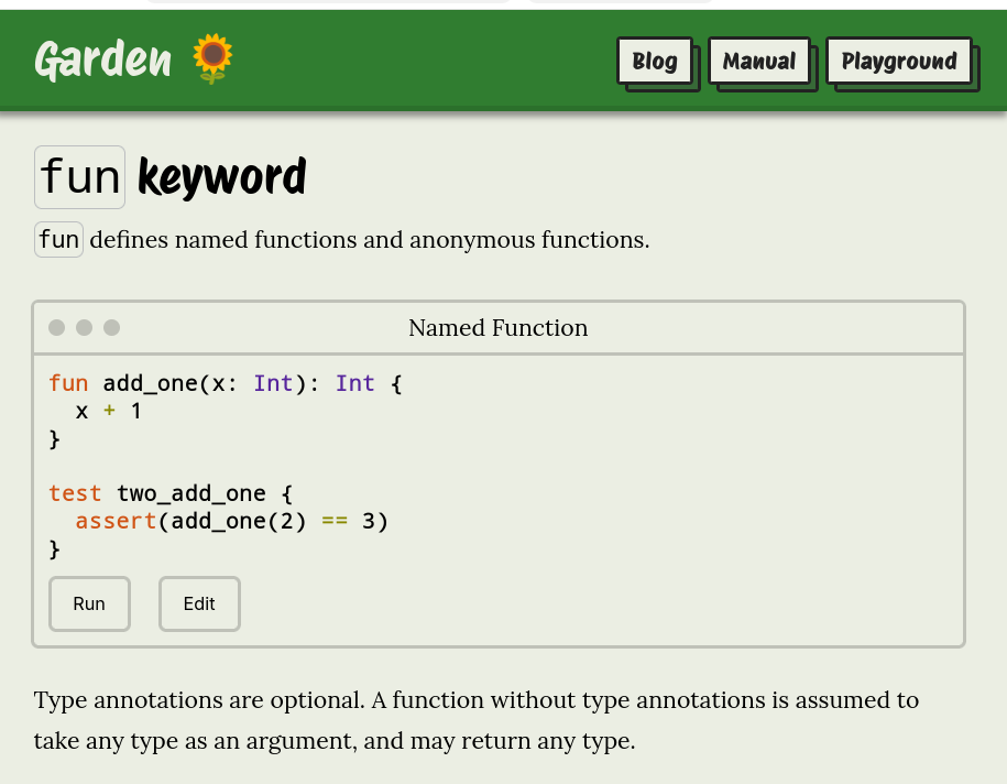
I'm experimenting with imitating window UI elements when showing code snippets on my website.
What do you think? Do the familiar dots of the title bar help, or is it just confusing decoration?
First image is the current style, the second image has the window UI.
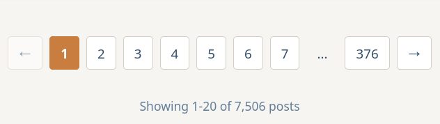
I've been experimenting with different pagination UIs.
It's so common to have arrows, but I've realised they're redundant here. When you have the adjacent values as well as the final value, you don't need > and >> arrows too.
Thoughts?
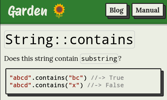
I'm experimenting with syntax in examples. I don't really like Rust's `assert(inc(1) == 2)` syntax, I find it a little distracting.
I'm trying `inc(1) //-> 2`. The comment is rendered differently, and there's nothing before the sample code. What do you think?