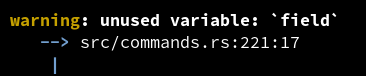
Why do so few CLI tools use colour inside their error messages? For example, rustc uses colour well in the error display, but there's no special styling of the content in backticks.
By contrast, markdown website almost always style backtick text differently from prose.
E.g. `field` is not specially styled here.
miniblog.
Related Posts
Difftastic 0.67 is released!
* Added support for protobuf, improved bash and YAML.
* Updated 16 parsers to the latest upstream version (thanks Antonin Delpeuch!)
* A ton of display polish for word highlighting, alignment, and binary files.
Doing another iteration on my diagnostics display. I'm reasonably happy with the bold highlighting within the error message.
I'm not sure about the colour on Warning and Error though. It gives the output some visual structure, but arguably the message itself is more important.
New version of difftastic is out! In this release:
* Improved git integration
* Polished the side-by-side display, particularly on large screens
* Fixed a nasty crash


