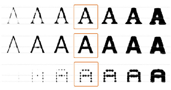
Augmented intelligence by building UIs that are backed by ML models:
miniblog.
Related Posts
I've been experimenting with different pagination UIs.
It's so common to have arrows, but I've realised they're redundant here. When you have the adjacent values as well as the final value, you don't need > and >> arrows too.
Thoughts?
I'm still experimenting with UIs for live (sandboxed) evaluation of tests. I've realised that you really want to highlight the failing assertion, not just the failing test.
Feedback welcome :)
Designing UIs is such a hard problem.
Sometimes I try a bunch of options and I settle on "this one seems the least annoying".


