A wonderful property of link aggregators is that they don't limit themselves to current affairs.
For example, HN regularly links to content that wasn't published this year (with a label to show the content is older).
It's too easy to largely consume content that's very new.
miniblog.
Related Posts
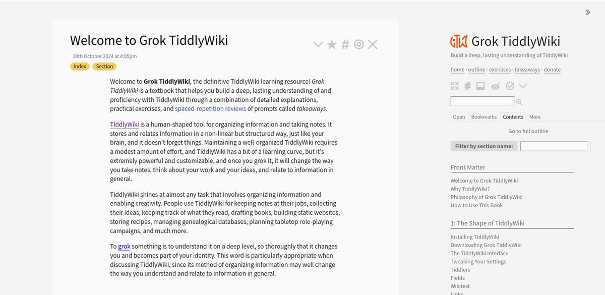
An interesting feature of the Grok TiddlyWiki interface: it has the sidebar on the right.
I see a sidebar on the left way more often, but arguably it makes more sense on the right for a wiki? The content is effectively more prominent.
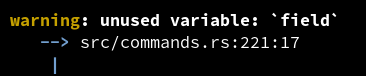
Why do so few CLI tools use colour inside their error messages? For example, rustc uses colour well in the error display, but there's no special styling of the content in backticks.
By contrast, markdown website almost always style backtick text differently from prose.
E.g. `field` is not specially styled here.
On the challenge of measuring spam prevalence externally, because historical data tends to be cleaner: