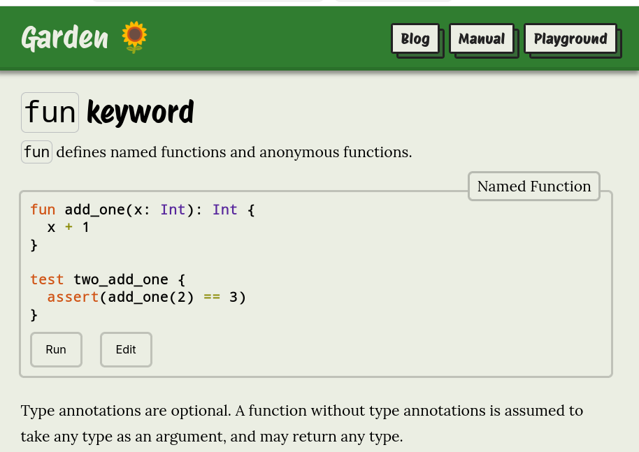
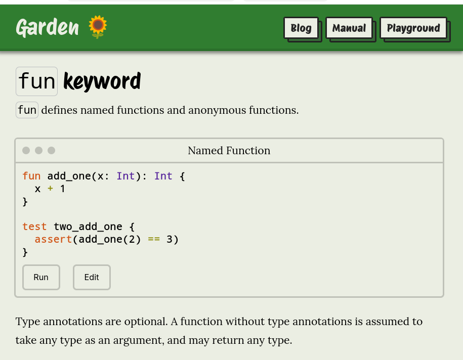
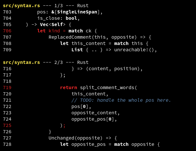
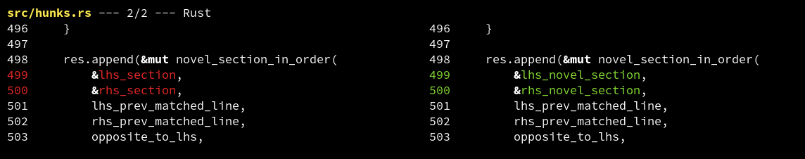
I'm experimenting with imitating window UI elements when showing code snippets on my website.
What do you think? Do the familiar dots of the title bar help, or is it just confusing decoration?
First image is the current style, the second image has the window UI.
Do you think language/API docs websites should support comments?
Pros: Adds context, familiar format, engages community
Cons: Can disincentivise contributions, comments might promote bad practices
I've only seen PHP and clojuredocs offer this.
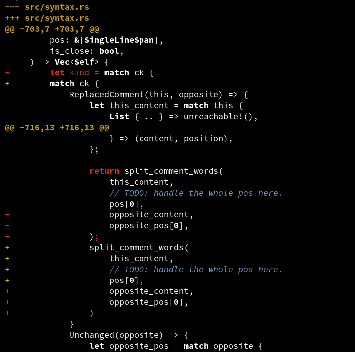
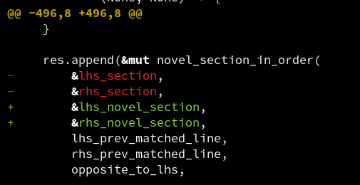
I've been experimenting with supporting the unified diff format in difftastic. This is a single column format ('inline') with @@ markers.
What do you think? This format doesn't scale well to larger changes, but it's super familiar and works with other tools.