The GitHub mobile UI is good: so good, in fact, that I have forked projects and sent docs PRs from my phone!
miniblog.
Related Posts
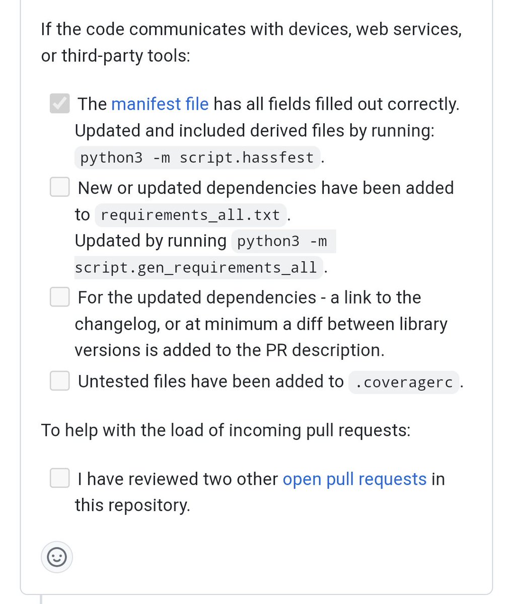
One interesting technique to reduce the review burden in Home Assistant, a project with a large community: ask PR authors to review other PRs!
Screenshot is from
Sweep is a really impressive demo of LLMs with coding: given your source code and an issue, it will generate a PR! Example: https://github.com/edreisMD/plugnplai/issues/65
I'd want to have a really thorough test suite if I was accepting LLM PRs though.
My favourite pull requests are PRs that are obviously correct after you've read the description.
