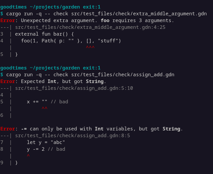
I'm experimenting with diagnostics formatting.
* I've added a left margin, showing both the file name and line numbers
* I'm showing one line of context above/below the offending line.
* I'm using grey for comments.
What do you think? Is there anything you'd change?
Related Posts
I'm exploring how I show lists in my documentation. I like boxes for tidiness, but it's much less space efficient. Which do you prefer?
I should also survey how other sites handle this.
One month after configuring my VPS to reboot weekly, and I'm *still* finding services that aren't properly configured to start on boot.
I'm developing a newfound appreciation for tools like Chaos Monkey.
I've been impressed with code written by Fable in my testing:
Difftastic: found small optimisations in a hot loop I'd already profiled extensively. Helped me prototype Dijkstra to A* too (hard to find a good heuristic).
Garden: Found some real bugs in my simplistic typechecker.