@krinkle@mastodon.technology I don't know of anyone using difftastic by default, including me! (I use it >50% of the time though.)
I toyed with background colours but I didn't find anything that I really liked. Contrast is hard, and depends on the user's theme.
Background colours look bad with syntax highlighting (e.g. red background with blue comment text).
It also looked silly due to ignoring whitespace between symbols.
It's an interesting space and I'm still experimenting :)
miniblog.
Related Posts
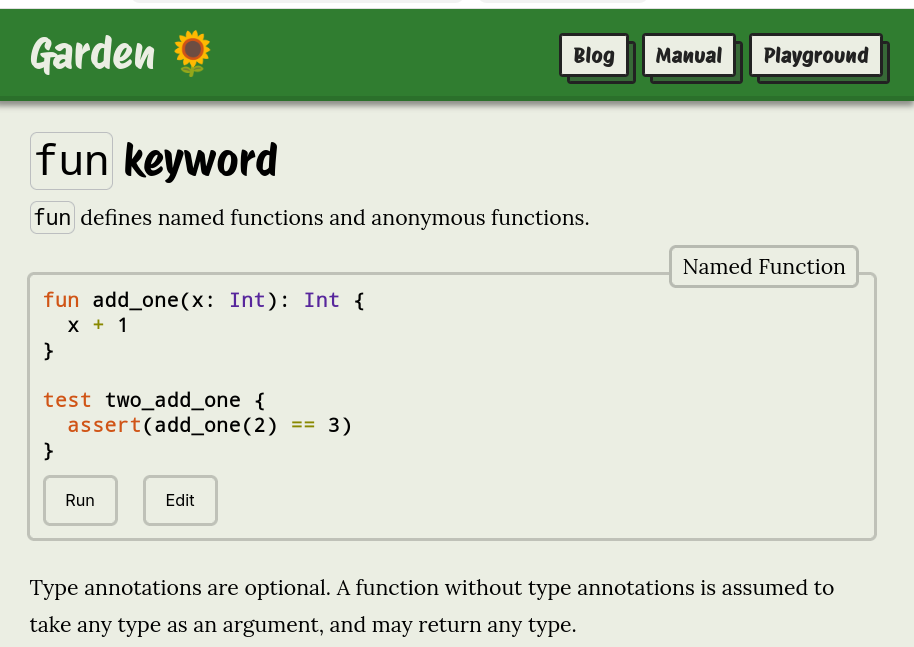
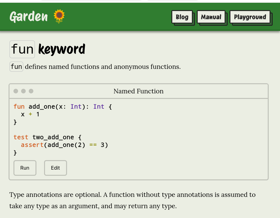
I'm experimenting with imitating window UI elements when showing code snippets on my website.
What do you think? Do the familiar dots of the title bar help, or is it just confusing decoration?
First image is the current style, the second image has the window UI.
24
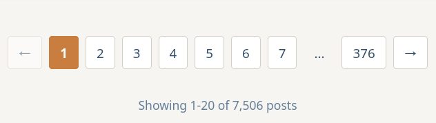
I've been experimenting with different pagination UIs.
It's so common to have arrows, but I've realised they're redundant here. When you have the adjacent values as well as the final value, you don't need > and >> arrows too.
Thoughts?

62
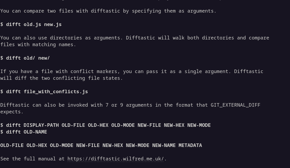
I'm trying to improve the readability of the --help output from difftastic.
I'm experimenting with making example invocations bold, so they are easier to distinguish from the text.
I'm also trying OSC 8 to make my URLs clickable.
Opinions welcome :)