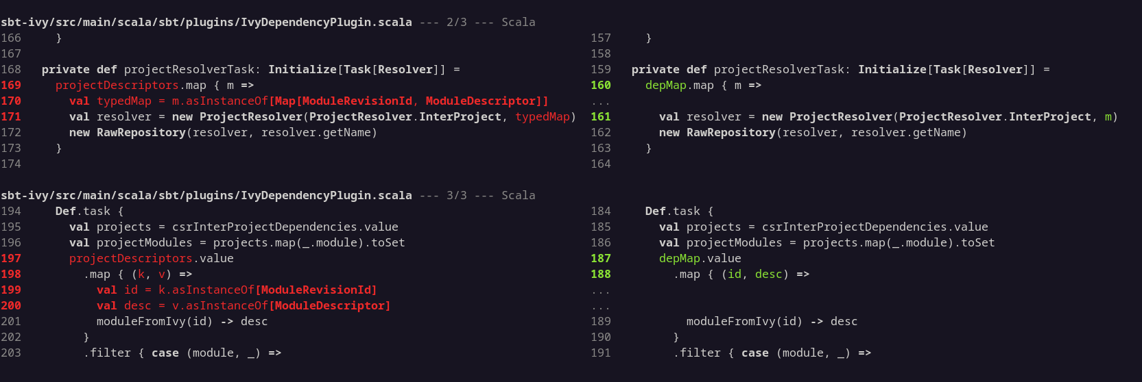
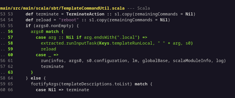
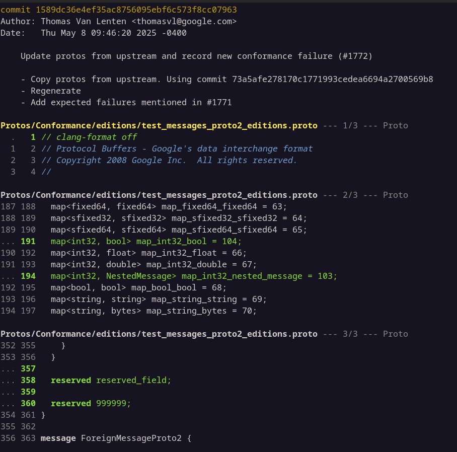
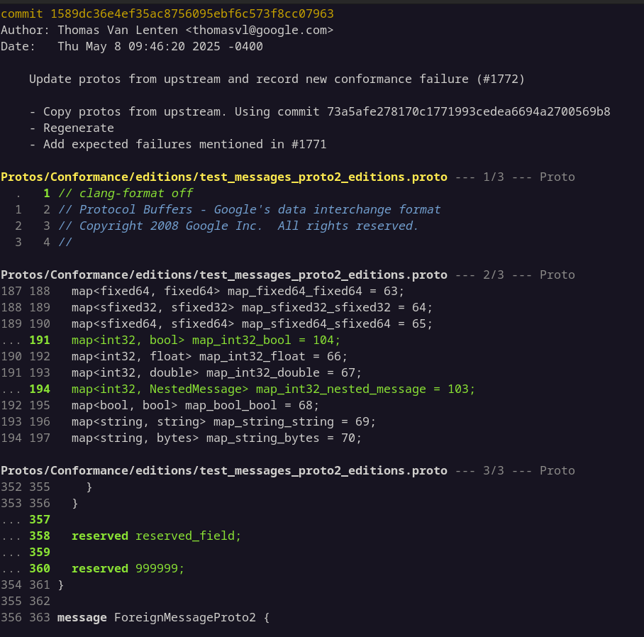
Adding too much coloured highlighting to difftastic kinda makes it hard to spot the changed bits.
I've tried making type names bold (same as keywords) and it looks pretty good though.
miniblog.
Related Posts
I've released difftastic 0.68! A smaller update, but still worth upgrading:
* Improved Bash, C, Go, Lua, Nix, Perl, Python, Rust, Scala, Swift and YAML parsing.
* Minor display and git compatibility fixes.
Difftastic 0.67 is released!
* Added support for protobuf, improved bash and YAML.
* Updated 16 parsers to the latest upstream version (thanks Antonin Delpeuch!)
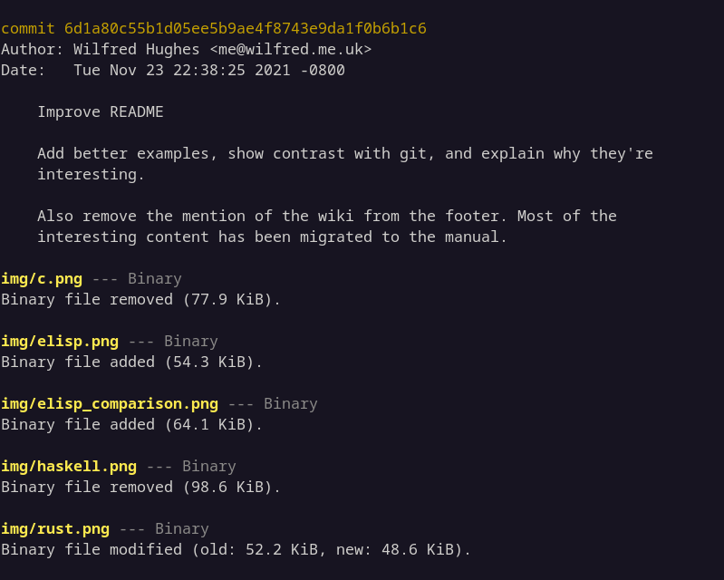
* A ton of display polish for word highlighting, alignment, and binary files.
"After I linked difftastic, one of my friends immediately used difftastic to find a stealthy bug, five stars!"

