One web design style that seems to have become unfashionable: external link icons:
External Page ⍈
I think it's because links are already distracting, and adding icons doesn't help. An email icon is still handy for mailto: links, as they don't open in the browser.
miniblog.
Related Posts
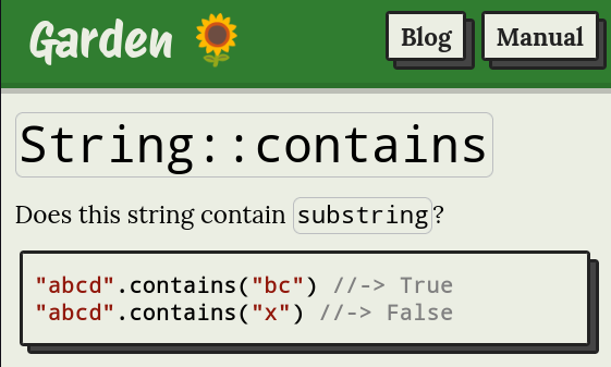
I'm experimenting with syntax in examples. I don't really like Rust's `assert(inc(1) == 2)` syntax, I find it a little distracting.
I'm trying `inc(1) //-> 2`. The comment is rendered differently, and there's nothing before the sample code. What do you think?
@nihilazo @eli_oat @technomancy @csepp The thing I like about lisps is the ability to build functions around snippets until I've written a whole program. It's interactive and pleasant.
I agree that the advocacy is distracting. The book Let Over Lambda has interesting ideas but it's *so* convinced that lisp is always the best.
I sometimes find it hard to read too. It's easy for different patterns to look visually similar.
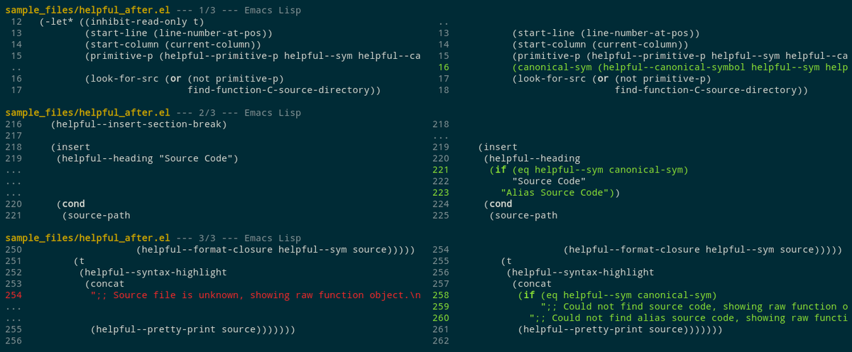
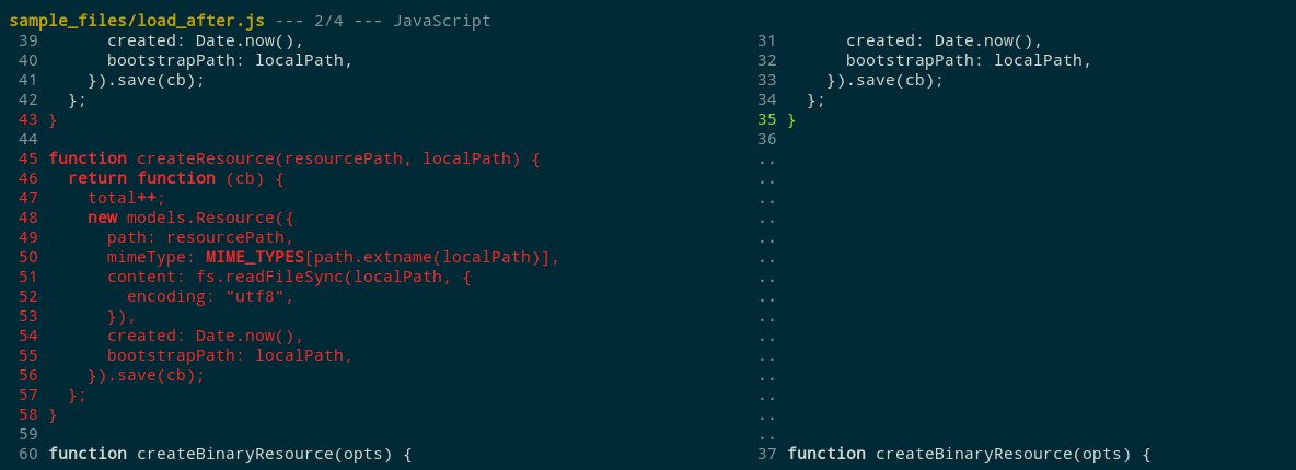
I've been wondering if line numbers should also be coloured if the line contains changes.
Here's how it looks in difftastic. I worry that it's slightly distracting, but I love how it makes small changes easier to spot (e.g. line 43 in the screenshot).


